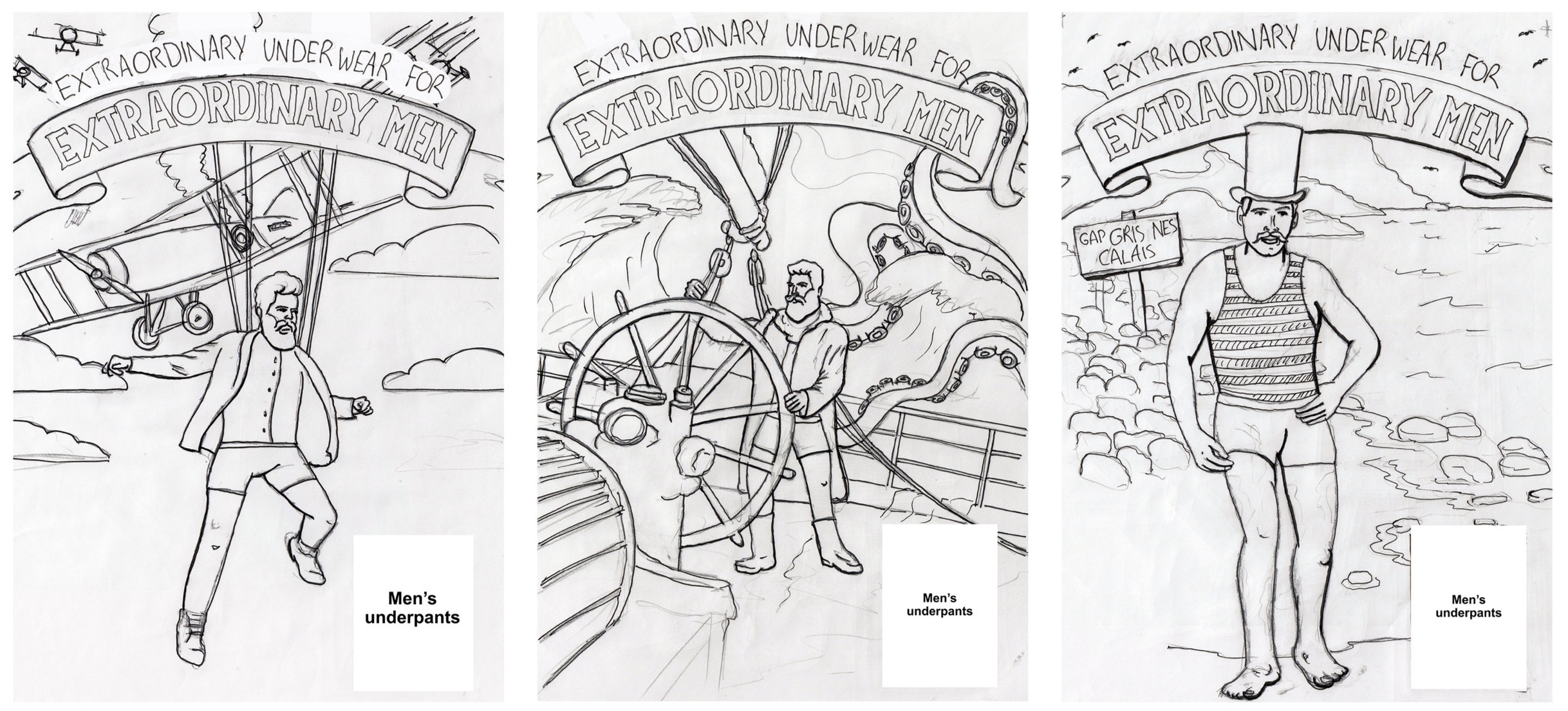
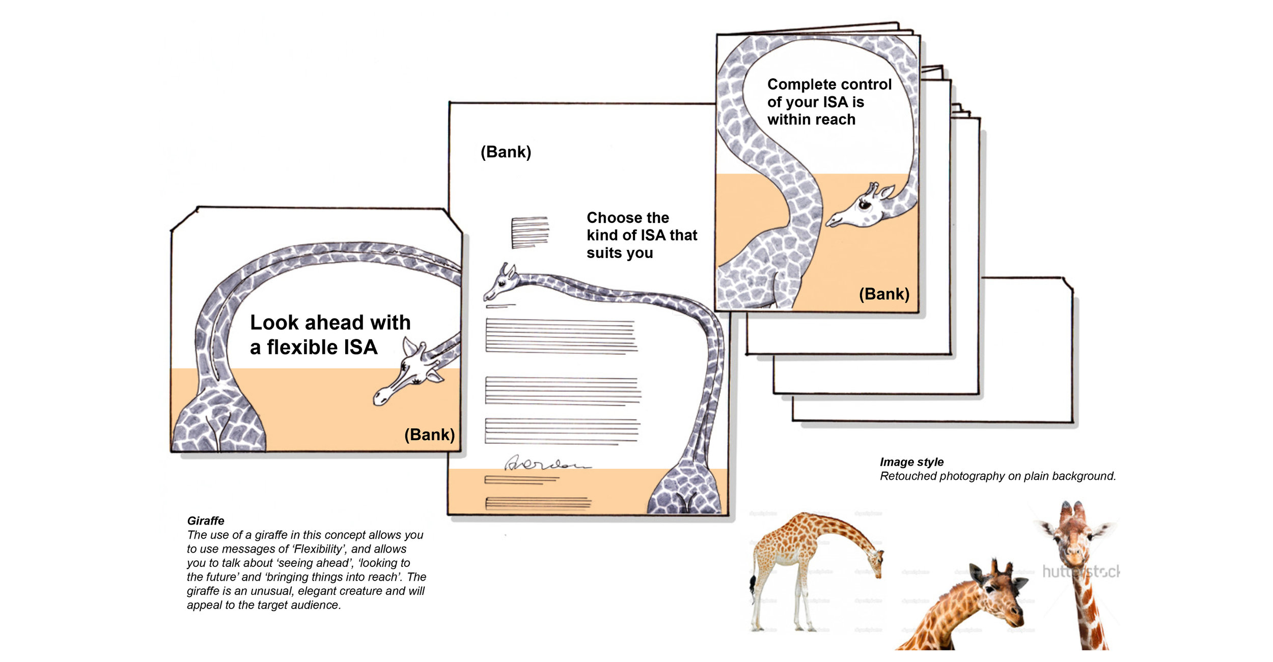
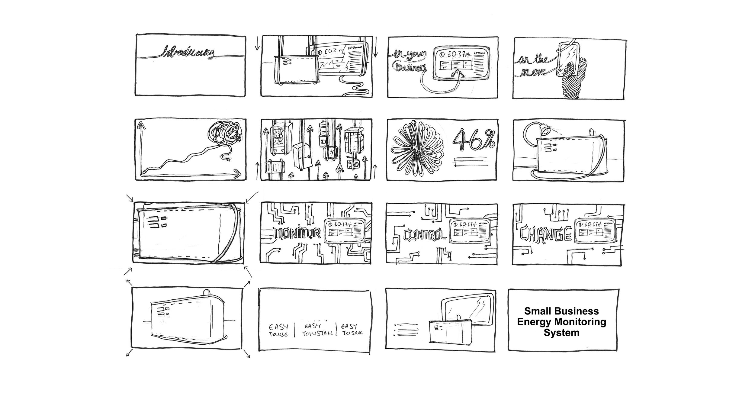
What is a scamp? For those in the advertising industry, you probably know, but beyond that, I think it’s probably not that common a term. It may mean different things to different people, but to me a scamp is a rough, a sketch, a hand drawn mock-up of an advertising concept. It will contain the visual idea and message which make up the ad concept, the art and copy.
They’re deceptively simple. They need to be loose and rough, yet they need to convey an idea instantly whilst leaving enough of the detail out.
In the past, it would have been the quickest way to get ideas across. A marker pen, a layout pad and a quick drawing and you can go away and present the idea. But times have changed. Powerful creative software and intuitive apps mean there are many creative tools at hand to create visual content quickly, often faster than drawing it. There’s the internet of course. It’s always there, instantly, you don’t need to scamp something as you can just Google a picture of it, or something similar. Speed isn’t really the reason for them to exist anymore. But, I argue they still have a really important role to play… and I bloody love them.
I first heard the term ‘scamp’ during my first early forays into the advertising industry. I had seen a post on The Leith Agency’s website, written by their Creative Director Gerry Farrell which listed some essential advertising books aspiring creatives should read, (‘The Copy Book’, ‘D&AD Annuals’, etc.). I was skint at the time and had little surplus cash to buy these books. But I went to Edinburgh city library and tracked the ones I could down. They were indeed great! But there was one I couldn’t find ‘Hey Whipple, Squeeze This!’ by Luke Sullivan. I was intrigued enough by the title to fork out whatever it cost for a second-hand copy on Amazon, and I read it. In it, he showed various ad concepts of his, in the form of a ‘scamp’. The quality of drawing was pretty crap, but that wasn’t the point, and was also what I liked about them. You could get an idea down quickly, and without feeling precious about the craft of it, at that stage. It was pure. A visual idea lifted straight from a sketch pad. I could do that. But I quickly lost that initial confidence.
I partnered up with my first professional creative partner. We were both were trying to work out which way our roles should evolve. We had both done visual-based creative courses (illustration for him and product and furniture design for me). He was so bloody good at drawing that in those early days, I fell into the copywriter role and he became the art director… so he drew all the scamps. Mine felt pretty amateurish by comparison.
We got our first break in the form of a placement from Michael Hart at The Union, followed by one at Frame and then our first ‘job’ at Barkers Advertising in Glasgow, During that time, I quietly tinkered with my approach to scamping, whilst working on copy for a couple of years. Eventually we were inevitably made redundant as the agency went under, so we found ourselves pounding the pavement once again looking for a job. After a couple of months frantically scratching about trying to pay the bills, we got one, from the newly formed Tangible (formerly Navigator), but with a bit of a problem for me. They didn’t need a copywriter.
We were split up, (thankfully for me, with hindsight, as I was never going to make it as a true writer) and I was made into a junior Art Director, partnered with great copywriters such as Andy Tucker, Richard Happer and Haydn Richard Harris. They were pure writers, but beyond the odd doodle, they weren’t responsible for the drawing, I had to do all the scamping, and I had nowhere to hide. My boss Tony also championed scamps and pushed me to step away from the Mac. I had to get good, quickly. I frequently took my sketchbooks home so I could do the scamps in this safe bubble of my flat, but gradually my confidence built as my scamps got better. I also think, having been partnered with someone who was so good at them at an early stage, meant I had set high standards early on, without really knowing it at the time.
I developed a hybrid style to scamping. Sometimes with a splash of colour, sometimes just black and white. Sometimes tracing stuff if needs be, sometimes not. So that’s my scamping story, but back to the point about speed, we’re not in the Mad Men age anymore, we have multiple tools around us for creating visuals quickly, so do scamps have a role now?
Yes. More than ever.
With a visual made up of stock images, fonts, graphics etc. The concept is already loaded with style. It can be hard to focus on the idea. With a scamp, a client can focus purely on the idea. They can’t get hung up on whether the blue is on-brand or not, if the typeface is right, or if the model is too boring/ugly/old etc. It allows them to embrace the concept. I think it pushes you, as a creative to be brave, and sell an idea and a vision as opposed to just produce content.
There are obvious arguments against the use of scamps, they usually take longer than whacking a mac visual together. Some clients are just not able to look at them, they are probably just too used to seeing everything visualised. They can’t make that leap, and likewise, some account handlers don’t feel comfortable presenting them. But I think there are other reasons why they seem to be dying out, which lie more with the art directors than anyone else. I think drawing isn’t being taught or done for fun as much anymore.
When I did my post-grad at ECA, I did it in Furniture Design, and we did life-drawing. At that time, every student, even the ones studying golf-course architecture had to attend life-drawing classes each week, something I hadn’t done since my foundation course at Newcastle college. I loved it! But I think most modern universities and institutions don’t do that anymore. I think there’s a nervousness amongst young art directors and designers to pick up the pen and just sketch out ideas. I have spent time freelancing in an agency that didn’t have any sketchbooks or pens. There was no point, none of their designers ever used them. That took me a while to digest. I have also had work in another agency purely to scamp, for a solid week of just drawing, because there was nobody in the in-house team that could do it.
I think it’s also to do with how we present work these days, it’s often simply emailed across. Who has the time to travel to meet in person, and who wants to fork out the expense if it’s not necessary? If you do work with scamps in that situation, you have to scan it in, adjust it a bit in Photoshop if it looks washed out, and then email it to people.
And then it comes back to time again too. It does usually take longer to scamp something than to mac it up if you’re good at the software. Design software is non-destructive too. You can undo digital files or keep editing them. If you cock up a scamp, it needs re-doing, or at least tip-ex-ing.
But I think all those reasons, especially the time factor, make them as invaluable as ever. If you can draw (a wee bit, they don’t have to be illustrations), and can pull scamps together. if you can buy enough time to get yourself in-front of people and pitch your idea, then a scamp is a much more powerful tool to capture the imagination. And in a time when everything is instant and disposable, when there’s so much content around all the time, I think it’s good to push the brain to interpret something for a change, instead of just absorbing stuff.
For me, if I get the chance, I’ll always scamp the shit out of it.
Note: Brand names removed. All concepts remain the copyright of the brands and agencies they were produced for.


